

The Psychology of Colors in Branding: How to Choose the Right Palette
In branding, every detail counts — from your logo and fonts to the overall visual style that shapes how people perceive your business.But one element often underestimated is color. The colors you choose aren’t just for looks—they influence how people feel about your brand and even affect their buying decisions.

🌈 Why Color Psychology Matters in Branding
Colors communicate emotions faster than words. For example, red can spark excitement, while blue can build trust .Research reveals that within just a minute and a half, people subconsciously judge a brand — and nearly 90% of that judgment is driven purely by color .This means your palette isn’t just decoration—it’s a business decision.
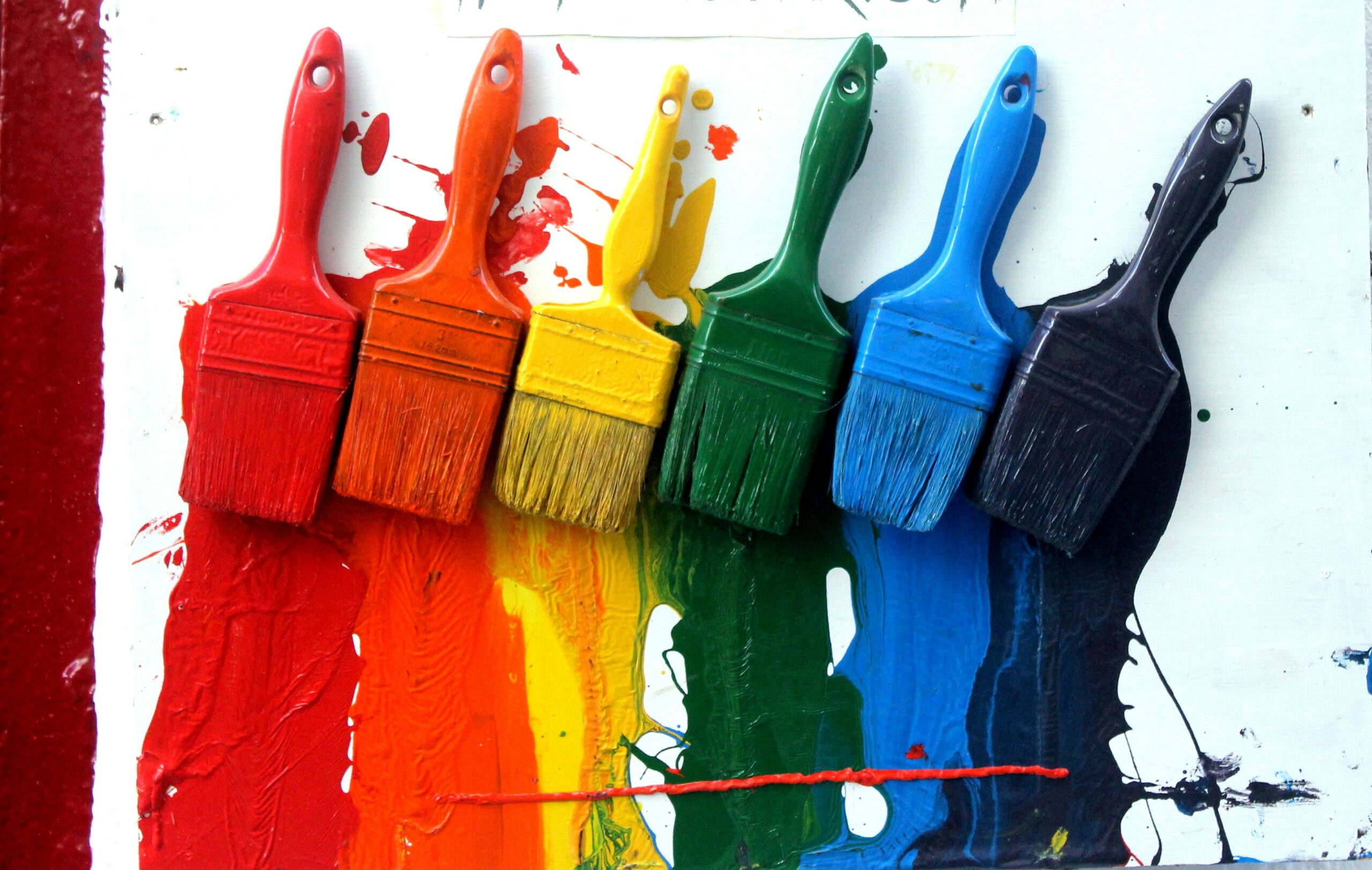
🖌️ What Different Colors Mean in Branding
-
Red → Passion, urgency, energy. (Used by brands like Coca-Cola, YouTube)
-
Blue → Trust, stability, professionalism. (Used by Facebook, PayPal)
-
Yellow → Optimism, warmth, friendliness. (Used by McDonald’s, IKEA)
-
Green → Growth, health, eco-friendliness. (Used by Starbucks, Whole Foods)
-
Black → Luxury, sophistication, elegance. (Used by Chanel, Nike)
-
Purple → Creativity, royalty, imagination. (Used by Cadbury, Hallmark)
-
Orange → Playfulness, affordability, energy. (Used by Fanta, SoundCloud)

🎯 How to Choose the Right Palette for Your Brand
-
Define Your Brand Personality
-
Is your business modern or traditional? Playful or professional? Your palette should reflect this.
-
-
Know Your Target Audience
-
Colors can appeal differently depending on age, gender, and culture. For example, younger audiences may prefer bold, vibrant shades, while professionals might trust muted tones.
-
-
Study Your Competitors
-
Look at what colors dominate your industry. You can either align with the norm for recognition or choose contrasting colors to stand out.
-
-
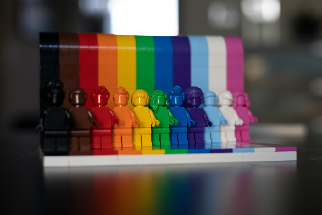
Limit Your Palette
-
Stick to 2–4 main colors (primary + accent). Too many colors can dilute your brand message.
-
-
Test Before Finalizing
-
Mock up your colors on real assets like websites, logos, or social media posts. This helps visualize consistency.
-
🔥 Pro Tips for Using Colors Effectively
-
Use contrast (light vs. dark) to improve readability.
-
Keep accessibility in mind (high contrast improves visibility for all users).
-
Create a style guide to ensure your palette is used consistently across platforms.
✅ Final Thoughts
Choosing the right brand colors is not just about aesthetics—it’s about creating an emotional connection with your audience. When done right, your color palette can instantly communicate your brand’s values, attract the right customers, and set you apart in a crowded market.
So, before you pick “just any color,” ask yourself: What do I want my audience to feel when they see my brand?